Natural-language triage
A real query — not a dropdown. AI maps the situation to specialties, equipment, and urgency before matching.
An AI-powered search, triage and transport layer that routes anyone in crisis across WhatsApp, USSD, web and voice to the nearest resource that can actually help. One platform. Nine roles. Three years of design.
Somewhere in a peri-urban community in Gombe State, a pregnant woman goes into labour. There's no ambulance she can call, no way to know which of the nearby health facilities has a bed, and no internet connection to even try. This isn't a rare story, Nigeria's maternal mortality rate sits at 1,047 deaths per 100,000 live births. The World Health Organization traces most of these deaths to three delays: delay in seeking care, delay in reaching care, and delay in receiving it.
Every one of those delays is, at its core, a design problem. That's the problem I've spent the last three years designing against.
The Problem
It's not that ambulances, hospitals, and trained personnel don't exist, it's that information about them is fragmented, infrastructure is underutilized, and there's no system connecting a person in crisis to the nearest resource that can actually help them. Over 45,000 medical and transport personnel across the continent are underpaid and underused simply because there's no platform routing work to them.
Eight Medical set out to build that platform. I was brought on as the lead product designer to give it a face.
About the Project
God's Eye is EightMedical's next-generation product currently in active development, not yet publicly launched. It is built to become the AI-powered search, triage, and transport layer beneath everything the company does. Once live, it will let anyone regardless of device or connectivity search for and book emergency resources: hospitals, ambulances, blood, oxygen, personnel, even credit to pay for care. A real query like "my mother is having chest pains" becomes a ranked set of facilities that can actually help, based on distance, specialty, availability and cost.
A real query — not a dropdown. AI maps the situation to specialties, equipment, and urgency before matching.
Match is by what a facility can actually treat, not just how close it is. Live bed & stock data feed the engine.
The same service surface across web, WhatsApp, voice and a USSD version that needs no internet at all.
A structured dataset of every emergency resource across every facility type readable by the AI layer.
Corporate and HMO deferred billing, so authorising emergency care never requires a card in the moment.
Ambulance pairing with a medic and pilot, tracked live from request through handover at the facility.
The Process
Before any of this could be designed, I needed to understand how emergency admission actually happens on the ground.
Shadowing how emergency admission actually happens on the ground, at Lagos State Teaching Hospital (LUTH).
Doctors in charge of admissions, HMO operatives, facility staff. Who gets admitted where, and why.
Search, triage and booking flows mapped end-to-end before any visual polish.
Usability rounds on high-fidelity Figma prototypes, with real users.
Feedback folded back into the design in tight loops weekly, not quarterly.
Production-ready prototypes validated before a single line of production code.
The Pivot That Changed Everything
Key design decisionThis single shift is the difference between a directory and a triage system. It's also, I think, the most consequential design decision I made on this project.
Our first version of the booking flow was simple, almost naively so: a user selects their health condition and location, and we recommend the nearest hospitals. They book ambulance transport if they want it. It felt clean. It also completely ignored the reality of an emergency.
What happens when the "closest" hospital has no ICU bed left? Or no blood bank stock for the transfusion the patient needs? Or isn't equipped to handle the specific condition at all? Sending someone to the nearest hospital, without checking whether it can actually treat them, can cost them their life just as surely as never sending an ambulance at all.
So I broadened the scope. I designed a resource dashboard for hospitals themselves. A place where facility staff can indicate their available specialties, equipment, and real-time bed availability by ward (ER, ICU, NICU, General). That data feeds directly back into the matching engine, so a facility only surfaces in a user's search results if it can actually meet the criteria of their emergency. I also led the design of the underlying Resource Bank. A structured dataset of every emergency resource across every facility type, readable by the AI layer to recommend care that's not just nearby, but genuinely capable of treating the patient.
Before · V1
User picks condition + location. Platform returns the closest hospitals. User books an ambulance if they want one.
After · V2
Hospitals publish live specialties, equipment, and bed availability by ward. AI engine only surfaces a facility if it can actually meet the emergency.
The Ecosystem
Most healthcare products are designed around a single user. God's Eye wasn't.
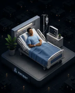
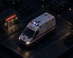
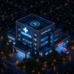
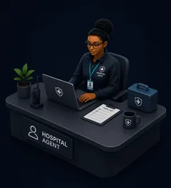
Every emergency involves multiple people working together under intense time pressure. A patient requests help, an ambulance provider accepts the dispatch, a hospital prepares for arrival, an agent verifies resource availability, and an administrator monitors the entire operation. Each stakeholder sees a different part of the journey, yet every decision depends on the same shared source of truth.
Designing this ecosystem meant creating nine interconnected experiences that felt independent, while remaining perfectly synchronized behind the scenes.
300+
Screens and flows
9
Role-based dashboards
3
Platforms (Web, Mobile, USSD)
1
Shared design system
Each product was tailored to the needs of a specific user group, but all were built on a shared design system to ensure consistent interactions, predictable workflows and seamless communication across the platform.
The Nine Products
Patients and callers can search for hospitals, ambulance providers, pharmacies, blood banks, and specific medical resources such as blood, medication, and equipment from one unified search bar. An AI assistant provides real-time first-aid guidance and helps surface relevant care options.
From there, users can book an AI-recommended or direct ambulance for themselves or someone else, move medical resources between facilities, order medication or blood, schedule transport for planned appointments, or arrange afterlife transport and morgue services.
I designed the hospital experience around keeping critical facility information current, including specialties, equipment and live bed availability across wards (ER, ICU, General, e.tc). I designed Service Level Agreement (SLA) countdown timers directly into this view so a bed count that hasn't been reconfirmed in 30 minutes visibly ages out of trust before it can mislead a match downstream.
Agents are responsible for verifying hospital information in the field. Their mobile experience was designed for speed, allowing them to update beds, oxygen, blood and equipment availability within strict service-level timelines.
Ambulance providers manage the supply side of transport, from onboarding vehicles, medics and pilots to accepting, rejecting and reassigning requests through to completion. I designed two connected experiences: a mobile app for day-to-day dispatch and mission management, and a DPI (Dashboard, Profile & Intelligence) web portal for fleet and rider management, performance analytics and financial reporting.
Medics and pilots also have lightweight mobile apps built around their specific responsibilities, allowing medics to manage patients during transport while pilots handle driving, mission updates and vehicle check-ins.
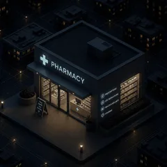
Pharmacies publish what medication and consumables they have and at what price, then manage incoming orders from hospitals and users against live stock. I built their inventory-and-order pattern around one job done well: state your stock, take the order, update your stock — nothing more, since speed matters more than flourish when a facility is ordering against an active case.
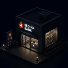
Blood banks run the same underlying model, tuned to a different product: publish available blood by type and Rh status, then manage urgent orders from hospitals and users against live inventory. I used the same shared inventory-and-order pattern here as I did for pharmacies, since the job is identical even though what's being tracked isn't — but accuracy carries even more weight, since a mismatched blood type is a different order of risk than a mismatched medication.
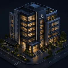
Businesses register through the same onboarding path as individual users but unlock a different tier once verified. A business dashboard for booking transport on behalf of staff, and access to deferred billing, so a company can authorise emergency care for an employee without a card being present in the moment.
HMOs book emergency care on behalf of their members and, like corporate organisations, run on a post-paid model — accumulating a balance the platform settles later rather than blocking care at the point of crisis. I designed their dashboard around that debt-first mental model: a balance owed, not a balance available, which is a small but deliberate reversal of how every other wallet in the system reads.
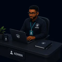
Admin sits above all eight other roles as the platform's central nervous system. Onboarding and approving hospitals and ambulance providers, monitoring every live mission on a map in real time, and holding unrestricted override authority to reassign an ambulance, escalate a case, or switch a payment mode mid-emergency. Designing for admin meant designing for worst-case Tuesdays.
The Shared Backbone
If there's one screen that has to work identically and simultaneously across nearly every role above, it's live tracking. A patient watches a countdown to pickup. A medic and pilot move through a status tracker (En Route → On Scene → Transporting → Completed). A hospital receives an arrival alert before the ambulance is even in the building. An HMO or corporate account gets the same alert if they're covering the case. And admin sees all of it, for every active mission, on one map.
Getting the timing, notification logic, and shared state right across that many views on that many devices, for people in very different emotional states was some of the most detailed interaction design work on the project. A ten-second discrepancy between what a patient sees and what a dispatcher sees isn't a bug; it's someone losing trust in the platform at the worst possible moment.
Taking It Offline
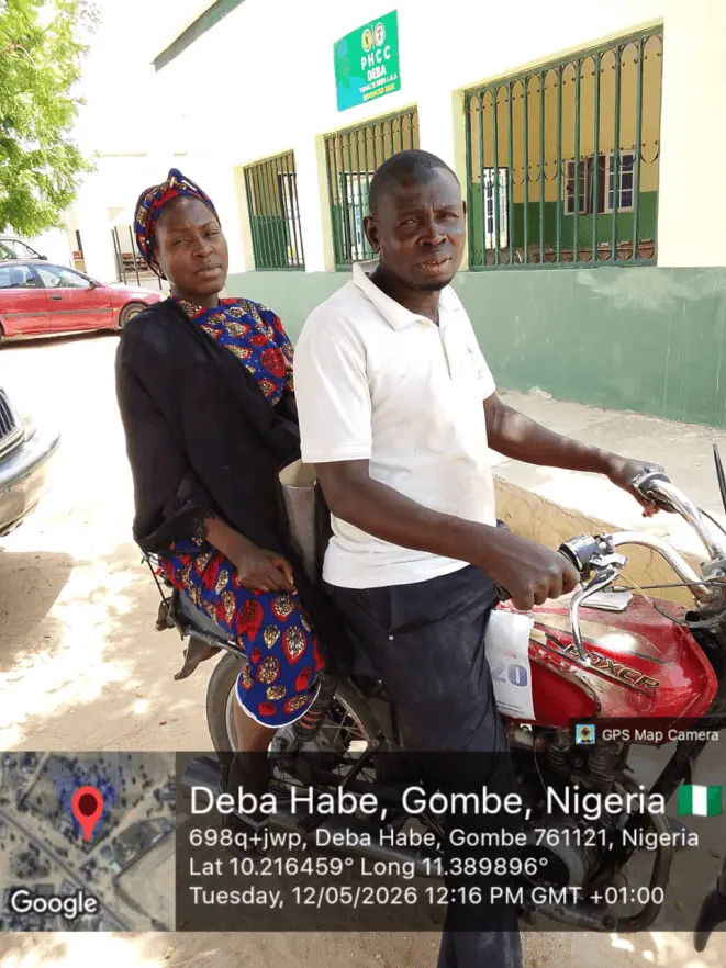
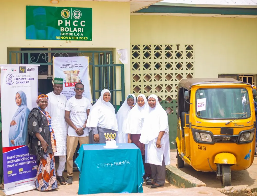
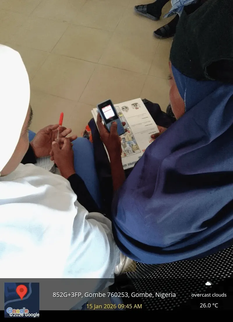
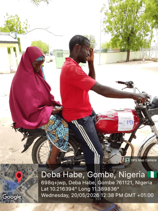
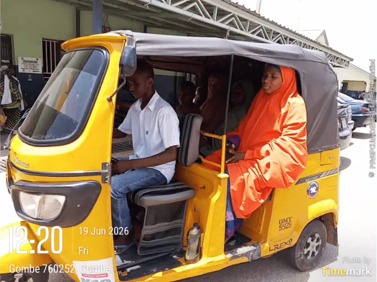
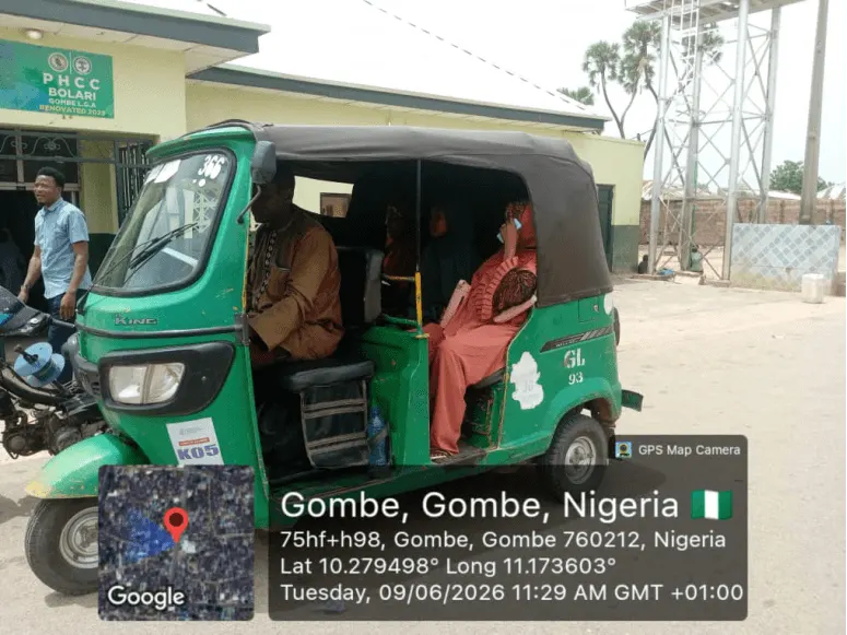
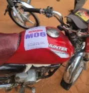
In Gombe State, most of the women we needed to reach didn't have internet access, and many were using basic feature phones. So alongside the core God's Eye product, I worked on designing the experience for Project Hauwa da Haulat ("care when it matters"), a USSD- and IVR-based version of the platform, delivered in Hausa and English, that lets a woman dial a short code to request transport for antenatal visits or obstetric emergencies — no app, no data, no login.
How it works
No app, no data, no smartphone required. The menu loads in Hausa or English on any handset.
Akko, Gombe, or Yamaltu-Deba, narrowing the response to facilities actually nearby.
Antenatal visit or obstetric emergency, so the system knows how urgent the request is.
Ambulance, Keke NAPEP, or motorcycle, matched to what's available and what the situation calls for.
Matched from the network of 11 primary health centres, 7 secondary facilities, and 1 tertiary hospital across the three LGAs.
A driver is assigned with SMS and voice confirmation.
The rider arrives, picks up the patient, and drives them safely to the chosen hospital
Two constraints shaped almost every decision. USSD screens allow only a strict character count, so every label had to be rewritten, word by word, to fit. Also, our first version made NIN registration compulsory at signup, until testing in Gombe showed it caused real drop-off: Nigeria's NIMC portal can be unreliable, and many women didn't have their NIN on hand during onboarding. We made it optional so women can simply complete the onboarding process with their phone numbers.
Every screen became a sentence. Every tap became a keypress. Running on a scaled-down USSD version of God's Eye's own technology, it's since became the world's first USSD-based ambulance booking service and also the first place any part of the platform I designed has actually gone live, ahead of God's Eye's own full launch.
Before God's Eye, Eight Medical had already proven demand for the model through manual operations. That track record is the reason God's Eye exists to run at the speed and scale only software can provide.
35,000+
Emergency callsProcessed through manual and legacy operations before the platform.
18,000+
Missions completedReal transports, real patients — demand proven ahead of God's Eye.
2,500+
Facilities connectedHospitals, pharmacies and blood banks in the network.
400+
Registered respondersMedics, pilots and transport personnel routed by the platform.
16,000+
Lives impactedEstimated lives saved to date across the Eight Medical network.
$25,000
MRRMonthly recurring revenue, generated ahead of the platform's launch.
Project Hauwa da Haulat runs on a scaled-down USSD version of God's Eye's own technology. Its results helped secure DPI-linked funding to expand the model — alongside a $52,000 World Bank–funded rollout into Edo, Kebbi and Adamawa States, and a €2,000 Social Impact Award.
3,000+
Pregnant women onboarded
500+
Trips facilitated
30+
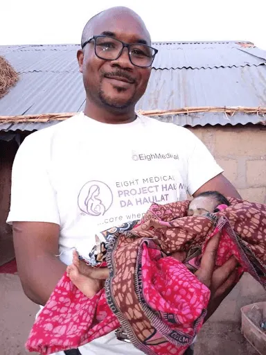
Babies safely delivered
15 mins
Average Response Time





The design of God's Eye earned industry recognition and directly supported the organisation's funding.
 Award · 2025
Social Impact Prize — Healthcare Innovation
View Source Watchlist
Digital Health Startups Watchlist
View Source Ecosystem
CcHUB, DIAL, DSN AI — supported by the Gates Foundation
View SourcePrototypes used directly in investor conversations
VerifiedReflection
The woman in Gombe I opened with isn't hypothetical. She's the reason a bed count now has a countdown timer. She's the reason NIN became optional instead of compulsory. She's the reason every USSD screen was rewritten, word by word, to fit. Three years in, she's still who I'm designing for.
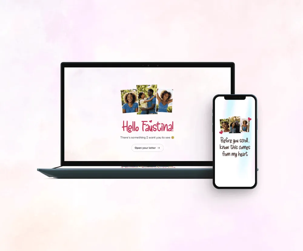
An interactive, personalized Valentine web experience designed to transform a simple message into a meaningful digital moment.
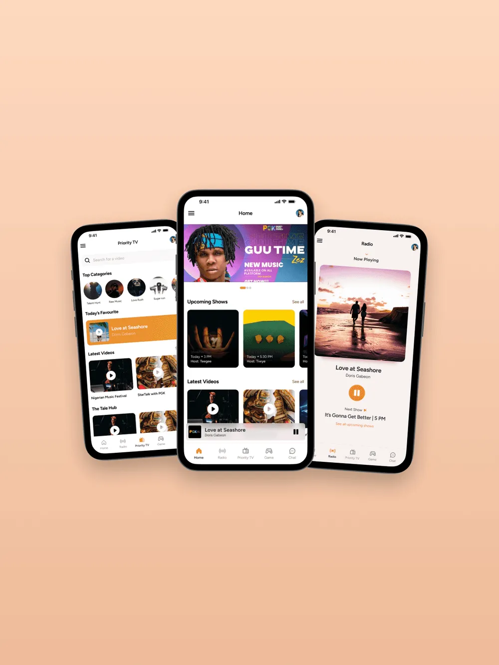
A modern redesign of the PGK Radio app improving live streaming, content discovery, and user engagement with a cleaner, more intuitive experience.